25 July 2019

Magical - watercolour marker, alcohol ink, embossing


Birthdays are special, filled with rainbows and magic. My magical card features a wizard from Newton's Nook coloured with Distress markers conjuring a birthday greeting filled with Spellbinders die cuts and embossing, a glittery Simon Says sentiment, and an alcohol ink rainbow.

23 July 2019

Bathing Beauty - coloured pencil, gift box


Splish, splash I was takin' a bath... soak all your troubles and cares away. My bathy gift box features a retired Kraftin' Kimmie set with Prismacolour pencil colouring and Sizzix die and embossing folder.


Bathing Beauty colouring - coloured pencil


This post is a companion to Bathing Beauty showing the colouring stages for Brigitte, retired stamp set from Kraftin' Kimmie Stamps with Prismacolour pencil colouring. While I am by no means an expert at colouring, I thought it would be fun to show my process.

I stamped the image on Bristol with Party Peach so the stamping wouldn't show when I was done. This is called a "no lines" technique. You still have lines, they're just not visible directly in the end.

For colouring, I use an embossing lightbox without the light. This gives me a rigid slightly slanted raised surface which is good for the ergonomics, i.e. I don't bend my neck over as far. I can also pick up the lightbox to bring it in closer for details (or when I don't want to bend my neck much at all).

I also wear magnifying glasses 'cause my close-in vision is not as good as my younger days *laugh* I've been far-sighted my whole life and still am, but close in is getting fuzzier (and the print on packaging is getting smaller, of course). When I look further away than 15ish inches with my glasses, it's very disorienting and oddly blurry and curved. So, glasses on for close, glasses off for far, it sucks when I drop something, like a pencil that twirls and leaps out of my hand like an acrobat on a trapeze.


For fair skin, I usually use my own blend: Clay Rose, Rosy Beige, Light Peach, Seashell Pink, Cream, and White. I often start with the second darkest colour, Rosy Beige, in the shadow areas then progress out toward the centre with the lighter colours to an overall smoothing with the lightest non-white, i.e. Cream for this blend, and/or White. I then add the darkest, Clay Rose, in the shadow. If the skin was getting overall a bit to sallow (yellowish), I added in Light Peach overall. Since there is a layer of pencil covering the paper, this mellows to a blend rather than a direct Light Peach. I build the shadows using the two darkest colours while smoothing and blending with the lightest until it's about the colour I want though a bit dark in the shadows on its own. For the non-shadowed edges of her skin, I used Light Peach then a little Rosy Beige if the curve needed a bit of a nudge. I keep my skin colours out of my case while I work on the rest 'cause some times I add a little more shadow or light as needed (or find a fleshy area I missed). I added Tuscan Red for her smile and used Clay Rose for her eyes.


I wasn't sure what I wanted for her hair colour so I decided to go on to the rest. I used Cool Greys and White for her white porcelain tub. I started with the second darkest shade I wanted in the shadows, 50%, then progressively lighter before adding the darker 70% then shadow to light again. I used a lot of 10% and White to smooth and blend to keep the white look. When trying to get a white look, I try not to get too grey.

While colouring, I was considering going over the tub with a clear gloss such as Glossy Accents or Nuvo Morning Dew but decided against it in the end as being a bit too over the top.

Looking at the pictures, I could have added a darker shadow area under her dangling foot, arm, and towel without losing the white effect. It's actually a bit more shadowy in person than in the pictures.


Still waffling on hair, I decided to brassify the tub feet and faucet. I used French Grey with Metallic Gold to build the colours and give it a bit of shine. At this point, I wasn't entirely happy with how the feet turned out but left them for later.


While colouring the towels, I added Metallic Bronze to the tub feet and faucet which worked to finish them. For the towels, I went with blues with black because I was originally considering this project for a Kraftin' Kimmie challenge relating to Ravenclaw creativity, but I am rather happy with the sumptuous blues. I started with Slate Blue and Blue Slate in the bathwater bubbles. I knew I was going to use something dimensional over them so wanted watery stand out shadowing. For the towels, Indigo Blue, Indanthrone Blue, China Blue, Cerulean Blue, and Light Cerulean Blue with Black and dark Cool Greys for trim and fringe. Like before, I started with the second darkest, Indanthrone Blue is a colour I hate to spell but love to use. It's gorgeous. China / Cerulean Blue is the colour I wanted the towels to appear. I love Cerulean. I always think of Tiepolo and the cerulean skies of his ceiling frescos in Venice (some of which I was lucky enough to see in person in the late 80s). I used 70% and 90% Cool Grey with Black for the trim and fringe for elegant Ravenclaw colours style.


And then, hair. I finally gave in to my predilection towards red hair *laugh*. I love colouring hair in shades of red because of the vibrancy. For pencil colouring, I often use a bunch of colours in the hair. For this flaming red gingery goodness, I used Dark Brown, Chocolate, Sienna Brown, Burnt Ochre, Pumpkin Orange, Mineral Orange, and Sunburst Yellow. Like before, I start with the second darkest, Chocolate, to define the shadows and start the flicks in from the shadow areas. I then add the lighter colours pulling the shadows toward the tops of curls over which I used Sunburst Yellow. Like the skin, once I have the basics laid in, I go back to the darkest, Dark Brown, for more shadow definition and then the other colours for colour using the Sunburst Yellow and Mineral Orange for smoothing and blending. Looking at the picture, there are a couple areas I would have added a bit more darkness to, but overall I am pleased with her flaming ginger locks.


Her hair is also a good contrast to the blue towels, blue-ish bath, and the blue background of Cerulean and Light Cerulean lightly applied for a chalk-like look.


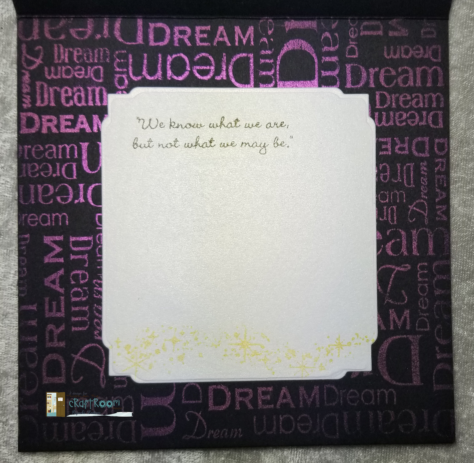
I did a loose fussy cut around the bathing beauty and then, to give her bubbles dimension and iridescence, I added Nuvo Cloud Dream Dops. I love the Dream Drops line but only have three of the colours... so far. The iridescence is so very shimmery pretty in life with the drops having rounded dimension, just like bubbles.


Ta-da, the finished project! What's your favourite hair colour?

22 July 2019

Special - TTCRD, tag, coloured pencil


This week, our sponsor for the Through the Craftroom Door challenge is very familiar to me, Sheepski Designs!


Living in Leeds, Yorkshire in the UK, working full time as a Management Accountant, currently working on 2 design teams and an obsessive crafter and creator of cards. I have no actual style as yet but do love the unusual and quirky. I may be known for producing cards in soft pastel colours.

I love anything arty. I've always drawn stuff, for as long as I can remember. In my younger days I sold a few watercolour paintings. I recently found mixed media which is a joy and love creating canvases with flowers.
I had a battle with digital drawing for about a year and finally found some software I could gel with. January 2016 a challenge team I worked on was short of a designer's images to create with so I drew some. I opened my shop a month later so I could sponsor challenges and give something back to the crafting world, to the lovely ladies who have supported me on my journey.

I've a Facebook group SheepSki Designs where I hold challenges, some for fun to win digis as well as my monthly card challenge. I've a SheepSki Designs challenge blog as well. Things are growing slowly (thankfully) so I still manage to spend at least a little time with my hubby 
Welcome to my world


My project features Forget-Me-Knot on a bookmark tag with Tombow pencil colouring and Distress Oxides on glossy paper peeking out from an Elizabeth Craft Designs tag die with a Unity Stamps sentiment.


Anchor - stencilling


In the turmoil of life, it's good to have someone who is your anchor to ground you and keep you safe. My card features stamp, stencil, and inks from Kraftin' Kimmie Stamps with Bo Bunny glitter paste, embossing, and Spellbinders die.

21 July 2019

Adventure - coloured pencil, embossing, easel card


My travel-inspired card features a Kraftin' Kimmie Stamps set and inks with Prismacolour pencil colouring, Spellbinders dies, and Stampin' up embossing folder.


19 July 2019

HB2U - alcohol marker


My card today celebrates the birthday of a music-loving teen featuring a stamp set from Kraftin' Kimmie stamps with Spectrum Noir colouring and a Tutti Designs die.


15 July 2019

Shop-a-holic - alcohol marker, patterned paper


Hi, I'm Rijacki and I'm a shop-a-holic, well, only a little, maybe. My shopper card features stamps, inks, dots, and stencil from Kraftin' Kimmie Stamps coloured with Nuvo alcohol markers and Tombow coloured pencils with a Memory Box die and papers from BoBunny, Hero Arts, and Lawn Fawn.

14 July 2019

Wonder - magic picture changer, coloured pencil, stencilling


A butterfly in a garden changes to...


a sentiment.

My magic panel card features stamps, stencils and inks from Kraftin' Kimmie Stamps with a Lawn Fawn die set and Cosmic Shimmer.

13 July 2019

Morning - coloured pencil, stencilling, embossing


As part of the reward for my recent challenge win for the Outlawz Sunday Song & Rhymes, I was asked to be a guest designer! The sponsor for the challenge is Scribble Designs.

July Morning by Uriah Heep

There I was on a July morning
Looking for love
With the strength
Of a new day dawning
And the beautiful sun
At the sound
Of the first bird singing
I was leaving for home
With the storm
And the night behind me
And a road of my own
With the day came the resolution
I'll be looking for you

La la la la

I created a glimpse of dawn with a Sunny Flower from Scribble Designs (one of the many wonderful freebie stamps) using Koh-i-Noor pencils, MFT stencil, Nuvo embellishment mouse, Distress markers with spritzer tool, Distress Oxide spray, Spellbinders die, and Stampin' Up embossing folder. The inside sentiment is from Unity Stamp Co.

12 July 2019

11 July 2019

Starry Sky - shadow box, watercolour marker, foiling, embossing


On a hill, even looking over a city, you can see a remarkable number of stars. It's a great place to have a quiet moment with someone you love. This couple is part of a stamp set by Kraftin' Kimmie Stamps and was part of the July Krafty Kit. It's part of the July release that will be available on Saturday.


Welcome to our favourite time of the month
at Kraftin' Kimmie Stamps!
It’s time to begin the
JULY 2019 release at Kraftin' Kimmie Stamps!
It’s Day ONE of our Krafty Peeks and we are jumping up and down with excitement to share all of our new goodies! We've got new stamps, new hybrid ink and new enamel dots! Hang on to your inkpads people....here we GO!
The first stamp set we are previewing for you is called LIFE IS A JOY and was designed by our fabulous artist, Cheryl Grant! This lovely stamp set is full of encouragement and love....not to mention adorable images and sentiments! The complete set features TWO large main images plus several sweet sentiments!


My shadow box card features feature Zig watercolour marker colouring, foiling over stencilling using Therm-o-web transfer gel and foil with a Kraftin' Kimmie stencil, embossing, and Nuvo confetti mirror stars. 

08 July 2019

Dream - stencilling, embossing, Perfect Pearls


My inspiration project for this week's Through the Craftroom Door challenge is a square card dedicated to dreaming. I love the stars and looking up at them to inspire me to dream where my life could be. My project includes a Visible Image stencil with Distress Oxide spray on black, Elizabeth Craft Designs die cut Way With Words, an embossed sentiment from Emerald Creek, and, inside, Perfect Pearls on a background sentiment stamp from Unity Stamp Co with Hero Arts sentiment and stars.


This week's Through the Craftroom Door challenge has no sponsor, so Cara is generously offering a $5 open gift card to the winner.

04 July 2019

Sweet Birthday - alcohol marker, die cutting


Trolling your birthday is a sweet thing. My card features a Kraftin' Kimmie stamp set with Tim Holz dies, Carabelle embossing folder and a whole lot of sweetness.

01 July 2019

Sunshine - die cuts, stamping, foiling


My card full of sunshine to brighten a dark day features stamps and dies from Impression Obsession.


Holly Cherub - Sheepski Designs, alcohol marker


July is here and hot in the northern hemisphere. Let's bring in some of the winter cool with Christmas/Winter in July! This month's challenge for Sheepski Design blog is Winter/Christmas. My card features the Holly Angel with golden filigree and sentiment.

SheepSki Designs Challenge Blog
SheepSki Designs Etsy shop
SheepSki Designs FaceBook group