

The Sheepski Designs blog challenge this month is Embellish It or Clean and Simple (CAS). Come play along with us! You don't need to use a Sheepski Design image (though we do like seeing them) to play along. Which style do you prefer to do?
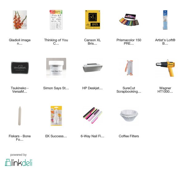
For my inspiration project, I chose to make a CAS card. I added a personal challenge and made it as a single layer CAS card. I used Gladioli - image 142, coloured the flowers with Prismacolor pencils, and added a sentiment in silver embossing.
SheepSki Designs Challenge Blog
SheepSki Designs Etsy shop
SheepSki Designs FaceBook group
Putting It Together
Single layer cards require a bit more planning before creating, doubly-so when using a digital stamp. Before I started, I Googled pictures of gladioli to decide on a colour. Mine aren't exactly the same as any of the real varieties (and there are a lot) but is inspired by Gladiolus Passos.

I trimmed a sheet of 300gsm Bristol from Canson to 11" x 8 1/2". In a photo editor, such as Photoshop, or word processor, such as Word, I resize the image to no more than 5 1/4" x 4" and place it in the lower right corner for an A2 card. I'm only using 1/2" of the sheet of paper for the card, so I'll use the rest later for a traditionally stamped image.

I like a top fold so I cut the sheet at 4 1/4" on the long side. Using the same print location, you can make a side fold card by cutting the sheet lengthwise at 5 1/2".

For the top fold card, score at 5 1/2". For a side fold, score at 4 1/4". An A2 card is one-quarter of an 8 1/2" x 11" sheet.

After scoring, fold and use the bone folder to reinforce the crease. Tada. An A2 card.

If your cutter leaves slightly ragged edges, you can use the coarse side of a nail buffer or an emory board to sand the edge.

While colouring, I use a slanted light box (unlit) to put it into a more ergonomic placement. This means I bend my neck less while colouring which helps reduce neck/back issues from the colouring. I used Prismacolor pencils. For the blue 'halo" around the flowers, I used a stump to blend and feather it out to the white card base.

I always keep track of what I use while colouring. This can be helpful if I want to use a similar blend later.

I added some Uniball white for the stamens and dry fit a sentiment. I didn't plan which sentiment before colouring so I had to find one that fit both in the space and also the mood I felt the card could convey. I chose a sentiment that could be used for a sympathy card or "I'm missing you" or any other situation where one would be keeping a friend in their thoughts.

I decided to use silver embossing for the sentiment. Heat embossing on a single layer card can be a little tricky since the heat will warp the card. Be careful how much you use the heat tool and heat from both sides to control the warping. Get the heat tool as hot as you can before bringing it to the card to melt the powder so it will melt and be done fast. Still, you might need to carefully bend the card to reduce the warping.

For the inside, I opted not to add another sentiment to keep the card versatile, but I wanted to add a detail to link to the front. So, I simply used two of the colours from the flowers to draw straight lines (with the help of a ruler). This keeps the inside from feeling too plain even though it is still blank.


One last thing about single layer cards, the supply list can be very small in comparison to cards with lots of layers.
Supplies
Challenges
The SheepSki Designs Challenge Blog challenge this month is CAS or Embellish It. Come play along with us! You don't need to use a Sheepski Design image (though we do like seeing them) to play along.
Challenges entered:
Addicted to Stamps and More: CAS
Simply Less is More: 1 Layer + Thinking of you
Watercooler Wednesday: Anything Goes
Simon Says Stamp Wednesday: Anything Goes
Crafty Gals Corner: Anything Goes


Simply Less is More: 1 Layer + Thinking of you
Watercooler Wednesday: Anything Goes
Simon Says Stamp Wednesday: Anything Goes
Crafty Gals Corner: Anything Goes


Love the soft beautiful pink and beautiful blue glow behind the flowers, so gorgeous Rijacki
ReplyDeleteAndrea x
Beautiful and fabulous coloring! Love the shades. Thank you for joining us at Simon Says Stamp Wednesday Challenge.
ReplyDeleteMarge
Wow, Kate, what a beautifully designed clean and simple card! I love those gladioli. Your colouring brings them to life. Beautiful choices of colours for the blooms and the leaves. The silver heat embossed sentiment adds so much elegance to your wonderful card. Thanks so much for joining our Watercooler Wednesday Challenge this week.
ReplyDeleteGreat job with your pencils! i really love all the texture in the flowers -I find it hard to leave "strokes" to my coloring and not blend everything... You've mastered the look! Beautiful sentiment too. Thanks for joining us at Less Is More!
ReplyDeleteAmazing coloring!Love the end result!Thank you for sharing with us at the Crafty Gals Corner!Hope you join us again soon!
ReplyDeleteHugs
Kleri DT
http://craftygalscornerchallenges.blogspot.co.uk/
http://kefartworx.co.uk/ (My blog)
I'm in awe of your skill with the Prismacolors! Just gorgeous. Thanks for joining us at Watercooler Wednesday.
ReplyDeleteWhat a terrific tutorial. Very informative and nicely written and just the right amount of photos. Your card is simply beautiful and elegant in it's clean and simple single layer format. Well done! Thanks for sharing with us at the Anything Goes Watercooler Wednesday challenge this week Rijacki.
ReplyDeleteGorgeous card, and a wonderful step by step tutorial. Thanks so much for sharing with us at Less is More, Anita x
ReplyDelete