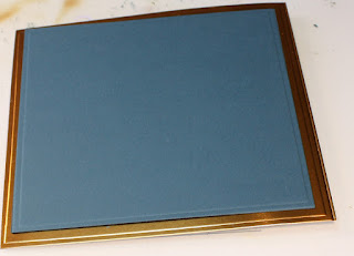
The embossing folder for the centre panel's texture is one I saw demonstrated by Jennifer McGuire. I fell in love with it in her video. I picked it up yesterday when we were in Washington to go visit friends.
Supplies
Putting It Together
"Guy cards" can be tough to put together mostly because a lot of the card makin' stuff is sold to appeal the the buyer and most of the buyers of the card makin' stuff are women.
A month or so ago I got this lovely stamp set from the "Stamp and Chat" group I've been gathering with once a month. It is, yes, a Stampin' Up group, but it is immensely mellow and never product pushy or 'colour by numbers' style. I'm a colour-out-of-the-lines crafter *laugh*
Deciding to make a square card, I cut a 5.5" x 5.5" square from light white cardstock. On one of the sides I had some paper fuzz, so I got out a dollar store nail shaper and, with a fine side, rubbed it on the edge to get rid of the fuzz.
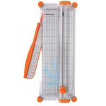
Using an idea gleaned from Jennifer McGuire, I wanted to mask off an area in the centre of my panel. I used Post-It note tape for the masking and my trimmer to make the lines straight.
My Post-It tape is 1" wide. At first I put it in 1/2" in from the outside edge but the centre square was far too tiny. I took it all off and put it 1/4" in.
I masked the rest of the outside edges because I didn't want to risk a boo-boo.
Distress Ink mini's are amazing, too, for the convenient way to store the mini blending tool foams. They're backed with the loopy part of velcro, the tool has the hook part, and fit perfectly into the base of the mini ink pads. Then 12 minis fit in one tin each with its own blending pad nestled in the base. Tim Holtz was smart to think of the storage while creating the product.
I used Salty Ocean Distress Ink to lay down a blue base.
I lightly brushed on Festival Green Perfect Pearls.
Brush, brush, brush. Then I spritzed it lightly with water.
I dried the blue green panel with the Wagner heat tool I got at the hardware store. It's nearly the same as the one sold for papercrafting at 1/3 the price. The biggest difference is the handle shape of the hardware store one. I actually find the shape of this one more convenient. Two heat settings and it heats up very quickly without so much noise you can't hear the dialog on the show you're streaming on Netflix.
After removing the masking the blue green has a nice look against the white. (Jennifer McGuire used one of the metallic Perfect Pearls that I don't have. I wanted to have blue-green and only have green, purple, and white Perfect Pearls *laugh*)
The We R Memory Keepers Next Level embossing folders have a grid so you can line up your paper more easily. Very cool. I almost want to take a Sharpie to all my other embossing folders to add a grid.
I ran the panel though the Big Shot. The Next Level folders are thicker than most embossing folders. I used all tabs on the platform but only one cut pad. The detail from the Next Level folders is amazing.
I wasn't sure what colour I wanted my world. I stamped both a green close to the blue green of the panel and black on a translucent vellum-like paper. I cut them using a circle die. Dies like that are so handy.
I tried the green globe but it didn't "pop".
The black looked much better.
I wanted to preserve the translucency of the globe but still needed to adhere it to the page. I decided I wanted it slightly raised so had to come up with a way to "hide" the adhesive but still have it secure. I put down a bead of Glossy Accents, which will dry dimensional, and let it dry.
While the world was drying, I decided I wanted to bring in some more dimension. The Stampin' Up Nearly Navy is a darker blue with a lot of green, darker than the blue-green on the white panel but still within the same family of hues. I am almost out of that colour and I love it so. Sadly, it was retired long long ago. I just need to find something similar to steal my heart. I paired the Nearly Navy with a bronzy coppery foiled cardstock. I used the Spellbinders matting square die to cut and emboss both with a matted look.
I trimmed the white and green panel to fit.
To finish the panel, I ran a bronze ink pad directly along the edge.
The tiny line along the edge finishes it perfectly.
Still waiting on the black globe to dry, I used the green one to dry fit for placement.
When the black globe was dry, I ran a tape runner over the ridge of the Glossy Accents and then adhered the globe to the background. From the scrap of the foiled panel, I cut a tag, stamped it with Stazon black and notched the end. I slipped the tag under the globe a little (can't say "a corner of the globe" *laugh*) extending out to be just over the edge of the white. I decided to adhere the white panel directly to the Nearly Navy to have a flatter card for mailing and because the embossed panel has more than enough dimension.
Now I just need to wait for my sweetie to write a note in it so I can mail it off from work. Even if I mail it tomorrow, there's a high chance it won't get to Missouri from BC before next weekend, but I was glad I procrastinated so I could use that really great embossing folder.
Sorry for the glare in the picture. That foiled card stock is rather unphotogenic *laugh*
Challenges
Simon Says Stamp 8 June Wednesday Challenge: Father's Day / For a Guy
Private FB group: For a Guy


This is a wonderful card! I love the gold and the vellum, too! Thanks so much for playing along with us for the Simon Says Stamp Wednesday Challenge!
ReplyDelete