Ta da! You're a show stopper! This card features a tap dancer on a stage in front of a glittery curtain highlighted by a spotlight.
For June 2016, I am one of the guest designers for Kraftin' Kimmie Stamps with the pleasure of being one of those to get one set of the new June release early to be able to create with it. The new release is on the 11th. The sneak peeks, including mine, will be revealed on the 8th with other sneak peeks all next week.
Today there is a new Saturday challenge on the KKS blog and this week the theme is Glitter/Sequins! So you have a full week to play along by creating a new project and linking it up to the blog post! I hope you can join us and submit your creation for a chance to WIN the monthly prize of a gift voucher to the shop!
Supplies
Putting It Together
The card, as usual, starts with an idea often sparked by one of more challenge. The challenges for this card were glitter or sequins and masking. Since one of the challenges was for Kraftin' Kimmie Stamps blog, I first looked through my growing collection of KKS sets (using Evernote) to spark an idea that would work with the challenges. I saw Trixie Tapper. a stamp I got recently but hadn't used yet, and the idea started blossoming.
A tap dancer on a stage should have a spotlight. I love theatre and so I know a follow spot casts a round light on both the individual and the background, so something for a background, oh a curtain. Curtain could be done with glitter. Should her outfit be glittered? Hmm...
A tap dancer on a stage should have a spotlight. I love theatre and so I know a follow spot casts a round light on both the individual and the background, so something for a background, oh a curtain. Curtain could be done with glitter. Should her outfit be glittered? Hmm...
First a test bit to see how both the glitering and masking out a spotlight will look. When I started the project I didn't have any microfine glitter (like what's used in the videos I've seen for this technique) so I tried some of the finest glitter I have in my stash. As you can see above, the lighter coloured, non-metalic glitter showed the masked area much better. I liked the purple but not the coral (pink) or green) so I looked through my stash for another colour of the same type (bought as a set). For the test strip I used a stencil but it wanted to stick to the adhesive too much, pulling up the paper when I removed it, so I changed that, too.
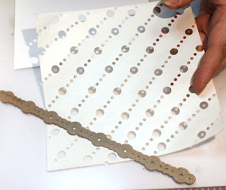
After putting the adhesive sheet on to the cardstock, I die cut the release sheet to make my own stencil or mask that won't stick to the adhesive. The die I used is a single long strip so I had to run it through a lot of times. I free-handed the locations of the die lines or else they would have been more even. This adhesive sheet has 2 release papers, I actually flubbed the die cutting on the first sheet so had to use the second (leaving my adhesive on the sheet without any cover for a short bit - I'm glad my cat wasn't in the room!)
Once the release paper was cut into a mask/stencil, I put it on the cardstock over the adhesive. Using a piece of the other release paper (that didn't have holes), I burnished or rubbed the entire sheet against the paper to make sure it was fullyattached all over with no edges sticking up.
I poured a light cascade of the first glitter over the sheet so it hit all the exposed spots. Then I took a cheap makeup brush and brushed off the excess. I used a coffee filter so I could pour the excess back into the glitter bottle. Then I wiped my desk and the coffee filter with a Swiffer dry cloth to pick up all the stray glitter bits.
With my fingers and then the uncut release paper, I burnished the first glitter while the mask was still in place. This is an important step. It makes sure all the glitter is fully adhered.
Then I carefully peeled off off the mask exposing the rest of the adhesive sheet.
I poured a light cascade of the second glitter over the sheet, again using a coffee filter. This time I poured the excess back into the jar before brushing the sheet with the makeup brush so my blue would not be contaminated with stray bits of purple that weren't fully adhereed. I brushed off the excess and discarded it (it wasn't very much) before burnishing the whole sheet again.
This is the finished glitter sheet. It has a soft, almost velvety feel to it. There are some lighter patches but no stickiness and the glitter doesn't rub off. If I had microglitter, this would have a more even coverage.
I stamped Trixie on to Xpress-It with ColorSnap black since it works well with my Chameleon markers.
Iwas intending to make her tuxedo black but for some reason she wanted blue. I wasn't even thinking about the background, just using colours I felt she wanted *laugh*
And then I fussy cut her out.
Dry fitting on the background. This is when I realised I had her outfit in the same colour scheme. Really. I can be myopic and daft at times *laugh*
Before going to bed I tried out a couple circle dies to see which would fit well for the spotlight. By the next day I decided this one is too big, a smaller spot would feel more intimate.
While away from the project at my day job, as I was thinking about the scene, I realised she would cast a shadow on the curtain, too. I decided to make mask that would cover all but the area or her shape. I stamped on to black cardstock (inexpensive cardstock I have on hand) with light ink and fussy cut around the image.
Since this would be a shadow, and parts of it wouldn't be seen at all, I cut around the lines without a lot of the fine details. Shadow mask done.
The spotlight mask was easy, just die cut a circle. I trimmed the curtain to the size I wanted for the final card.
Before I had started working on the card the second night, I had picked up some packages of stuff I ordered. In one of the packages was more Distress Ink minis (YAY!). I had done my original test with Black Soot but thought had been thinking a dark blue would look better, brighter (brighter for shadows? such an oxymoron *laugh*). So, on a scrap of the curtain I tried both the Black Soot and the Faded Jeans. The blue looks less stark and more shadowy and, yes, more bright.
I put Trixie where I wanted her to stand (just slightly off the bottom). I laid the circle mask over most of her and the backround near her. I intentionally left the bottoms of her pants out of the circle just like a spotlight is often above the floor and not hitting the bottom of the legs of a performer. I had her feet off the bottom of the curtain to, hopefully, give the illusion of standing on a stage with a curtain behind her. I used Faded Jeans Distress Ink.
To place the shadow, I put Trixie in place then laid the shadow opening over her. I carefully slid the shadow over a little so it was slightly to one side of her. Because I hadn't thought of a light coming strongly from one side, vs from directly in front, I hadn't coloured the highlight to the side. Thus,I couldn't have the shadow too far to her side or it would look odd, too much light coming from 2 angles. I could have done a softer shadow to the other side, too, to give the illusion of 2 spotlights, but rejected that idea as possibly making it too busy.
The shadow and the spotlight alone. I really like how this looks. I am going to have to save this idea for something else later.
Dry fitting Trixie on the background. Perfect. Looks exactly as I envisioned. Now on to the background of the background.
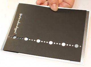
Using the same die I used for the curtain mask, I cut a single line that I planned to back with silver foiled cardstock. I also added the sentiment in Versamark and silver detail embossing. "You're a show stopper!" from the KKS Show Stopper set.
Since the curtain panel was going to cover the centre of the card and I only wanted the silver edging to be on the sides, I cut two pieces of the silver foiled cardstock. Here I have it dry fit to see how it will show out the holes.
I adhered the silver to the back of the black with a sliver on the right. On the left I exposed more of the silver to bring the whole background to the width I wanted it for the card. The silver is very reflective so appears white in the big dot in this photo. It really is silver.
I used foam mounting tape on the back of Trixie to pop her up over the shadow with it just a bit to her left. I also matched up where the spotlight crosses her lower legs. I added two silver backed clear stars to finish the scene panel.
I debated having the whole scene 'popped' up or flat on the card base. I decided on flat partly because I am running horribly low on the foam tape *laugh* But, flat does make this card more 'mail-able'. As fun as dimension is, it's not so good for mailing.
And so, Ta da! The Show stopping toe tapper!
Simon Says Stamp blog 1 June Wednesday challenge: Mask It
And so, Ta da! The Show stopping toe tapper!
Challenges
Kraftin' Kimmie Stamps blog 3 June Saturday challenge: Glitter/SequinsSimon Says Stamp blog 1 June Wednesday challenge: Mask It
Things I learned
- Exta fine glitter will work for the masked glitter technique, but has a slightly patchy look.
- A shadow in a spotlight would be cool as a card for itself. Maybe have the actual stamp inside?
- Glitter is a messy medium.. oh wait. I didn't learn that, I already knew it.
- Getting a bunch of packages at the same time with lots of stuff you ordered is a lot like Christmas for a young child. Squeeee! (I already knew that, too, but it's still fun.)
How would you use a glittery background like this?
I'd love to hear your replies and even see what you've done. If you make a card or other items using the techniques I show on my blog, I would love to hear about it and see them.


Oh my, this is awesome! Your tutorial is fabulous! All your hard work really paid off with the final result! Love the glitter! Thanks so much for playing Simon Says Stamp Wednesday “Mask It” Challenge! Well done!
ReplyDeleteThank you! Thank you, too, on the compliment for the tutorial.
DeleteThis is fabulous! Thanks for playing along with us at Kraftin' Kimmie Stamps!
ReplyDelete