Like out of the pages of Le Mort d'Artur, a knight standing tall and proud in shining armor on a field of heraldic banners is encouraging bravery. This Kraftin' Kimmie Stamps image is coloured with Perfect Pearls and Distress Inks and paired with Graphic 45 paper.
Supplies
Putting It Together
Le Mort d'Artur by Sir Thomas Malory is one of the first known 'novels' of the retelling of Arthurian legends. I read the book while I was in college as part of one of my English literature classes and still have it on my shelf to refer to from time to time. Le Mort d'Artur (The Death of Arthur) was written in 1485 in late Middle English, which is definitely not modern or current English but not so far from language we use today that it's incomprehensible even if you don't normally read Middle English. It was written a couple centuries earlier than Shakespeare. Many of the tales in the two volumes are familiar, but only because they've been retold many times since. The chapters are very short and the unlike novels of today. There's many many many battles where one person smote another and, I'm sure I've seen mentions of people in later battles that were smote in earlier ones. Smote means killed, but some of the smoting..err smiting.. is rather.. well.. kinda creative. Most of the characters we've come to know and love in the Arthurian legends are present somewhere in the telling. If you want to read it for yourself, it's online as part of the Gutenburg project: https://www.gutenberg.org/files/1251/1251-h/1251-h.htm
Have I mentioned that my degree is in history with English lit as my minor *laugh* My preferred historical time period is late Medieval, naturally.
Have I mentioned that my degree is in history with English lit as my minor *laugh* My preferred historical time period is late Medieval, naturally.
The idea for the card started in my head as I was walking up and thinking about masculine card ideas. I laid out the stamps in a dry fit to see play with the idea to see if it would work. I had just added cling foam mounting to the rubber stamp and hadn't removed the covering from the cling side yet.
I used the Misti to stamp the image. Since it's a rubber stamp on cling mount, I have the black foam out of the Misti. I keep breaking magnets *laugh* I've wrapped them in washi tape so I can pull them apart easier when they've gone flying to clack together. Putting them 1 inch apart they can behave and stay apart or putting them 3 inches from each other can attract them to go slide-clack unexpectedly. I still need to get a bar, or two, of the right width to replace the rounds.
I stamped with light blue ink that dries waterproof. The first stamping didn't get an even stamping (bumpy paper) so...
.. I stamped a second time. This is the beauty of using a stamp positioner like the Misti.
I decided to use Perfect Pearls for the metals of the armor. To mix the Perfect Pearls with water, I use a broken slat from our window blinds. I cleaned it off and now it's my palette. Perfect Pearls dry waterproof, like acrylics, so it's handy to have something which can be re-used but doesn't need to be wiped down. Using a brush I transfer a small pile of the powder from the jar so I can mix it with varying amounts of water with a waterbrush. As long as it stays wet, it's water soluble. Perfect Pearls does not dry as a resist, this means shadowing with Distress Ink can be added over it. Perfect Pearls is also mostly translucent which helps for detailing.
Using Pewter, I painted the silver parts of the armor.
I added Gold to the accents on the armor.
I've been lucky enough to see many suits of armor, both original and reproductions. A lot of armor in the Middle Ages was decorated, especially when it was the armor of a nobleman of wealth and position. Some of it is downright gaudy. As the Middle Ages segued into modern, the armor got more gaudy and less functional as it started to be worn more as a fashion statement than garb of war. A pokey-outy bit on the top of the helm was less likely in a suit of armor intended for battle because it could be a liability, directing blows to stay on the head rather than glance off.
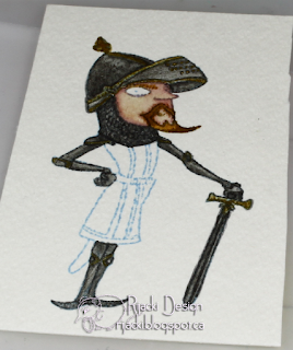
This knight's suit has simple decorations of brass on the edges of the cops (rounded things covering the joints and allowing them to bend) and parts of the helm as well as brass for the cross guard on his sword.
I used the light olive Old Paper to give a base to his skin.
The added shading with the slightly purply Victorian Velvet.
I blend on Tattered Rose to finish the skin.
I deciced to give him reddish hair, starting with Tea Dye and Vintage Photo shadowing then adding in Rusty hinge and more shading with Gathered Twigs. Aside from Tea Dye, the other three have a red tint. I also made sure to paint his eye brow as well.
I added shading to the armor with Black Soot and Hickory Smoke. I also added in detailing for his chainmaille coif.
Lastly I painted his tabard in heraldic colours. In the rules of heraldry, colours like red and blue, cannot be next to each other but are divided by the metals of gold or yellow and silver or white. The colours are also generally the more like primary colours. I gave him blue eyes (or rather eye) to contrast with his beard and tie with his tabard. I added a tiny dot of white with a gel pen to the black pupil to give the eye some life.
I keep wanting to set up to do video of how I paint. I just need to get it all set up..
I keep wanting to set up to do video of how I paint. I just need to get it all set up..
I loosely fussy cut the knight to place on the card and allow the background to show through. I loosy fussy cut so I wouldn't have too many too thin to add adhesive to areas. I love the style of Annie Rodrique of Kraftin' Kimmie Stamps, but she does make some pretty spindly arms and legs.
Using a Brilliance pad, I added gold to the edges of the shield background I cut for the knight. I love all the heraldic symbols on this Graphic 45 sheet. The thin line of gold on the edge gives a nice finish.
I matted the background with Not Quite Navy from Stampin' Up. I got a bunch of this lovely retired colour from a friend and will be very sad when I run out.
Changing my original design a little, I decided to punch a flag from Core'dinations color-core paper. I love the texture of this paper. Even more, I love that it can be sanded to bring out the core colour and add a distress look.
I did one last dry fit after stamping the flag with black archival ink. Because the flag was shorter, I decided to play the knight to the right and the sentiment behind him. With the flat edge of the flag behind him, it looks longer.
I decided I wanted to have the flag and knight popped up with the night popped up higher than the flag. To make this easier, I added one layer of foam mounting tape on the knight and flag, then attached the flag to the side of the knight, overlapped just so the end is out of sight behind him. Then I added a second layer to the knight where the flag wasn't. Then, I applied them both to the background on the card.
I made a top top opening card base from Simon Says Stamp 120 lb white cardstock and added the pieces. I added a ruby gem to the sword cross-piece to complete the card.
For the inside, I added a bit of scrap from one of the other sheets of the Graphic 45 Enchanted Forest pad matted with Ruby Red from Stampin' Up, another retired lovely colour. I stamped the second sentiment also with black archival. I like adding a design detail to the inside of cards when I can think of one.
Challenges
Simon Says Stamp Monday challenge: Based On a Book (Le Mort d'Artur)
Kraftin' Kimmie Stamps Saturday challenge: For the Boys/Men
Creative Moments: Keep it Masculine
Through the Craftroom Door: Anything Goes
Addicted to Stamps and More: Anything Goes
A Bit More Time to Craft: Anything Goes
Inspiration Destination: Anything Goes
Crafty Hazelnut's Patterned Paper: Anything Goes
Love to Scrap: Anything Goes
 |
 |
 |
 |
 |
 |
 |
 |
 |


Fab card Rijacki, thanks for sharing with Inspiration Destination and hope to see you again next time. Wendy DT xx
ReplyDeleteFabulous card Rijacki :-) I love the knight in shining armour and medieval theme, absolutely brilliant! :-)
ReplyDeleteThanks for joining us on the Simon Says Stamp Monday Challenge
Luv
Lols x x x
Thank you for showing how you did this wonderful image!!! so intresting to be able to look how you did this !!
ReplyDeleteSo wonderful creation and a wonderful design!!!
Thank you so much for entering our ATG challenge at Through The Craft Room Door this week. Looking forward to see you again next challenge.
Regards,
TTCRD DT
Cicci With the Pen {welcome to vistit my blog}
Through The Craft Room Door
I love this card and you made the chainmail looks so real!! Beautiful! It's always great to come visit your blog and see how you put your projects together! Thanks for joining our Kraftin Kimmie Stamps challenge this week!
ReplyDeleteMarilyn DT
This is a real interesting stamp! Imagine all the crazy sentiments that would go with this image! Super fun! ♥ Sue Kment
ReplyDeleteThe heraldic DP and your knight are a perfect match.
ReplyDeleteThanks for sharing at ATSM this week. :)