This simple card with CAS design was surprisingly complicated to make because it's a single layer card. Cheers! Aged to perfection!
Challenges
Less is More: Single Layer with Outlines and, of course, CAS
Freshly Made Sketches: Sketch
Can You Case It: Colours - Silver, Eggplant, Neutrals
Supplies
I actually made the card twice because I flubbed a couple things on the first attempt. But, I liked the look so much I kept with it and made a second, which I almost flubbed, too!
To start the project, I created a top opening A2 card from watercolour 140lb cardstock.
I did a dry fit of my layout idea. A masked sentiment from a die and an outline stamping.
For the layout, I used a challenge sketch.
I used a Simon Says Stamp die to create the mask for the sentiment. I cut the sentiment from a large edge-to-edge Post-It for the mask. I backed it with a bit of release paper left over from another project.
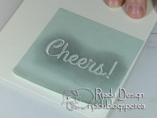
I used the negative space to create a stencil which I applied directly to the card base. On my first flubbed card I got a bit of the ink from stenciling off the edges of the mask, so for this one I added more masking to cover the rest of the card side to side.
Using a blending tool, I pounced on Distress Ink: Weathered Wood.
Keeping the mask in place, I brushed on Perfect Pearls: Pearl over the Weathered Wood. The ink was still damp enough for the powder to adhere. To make sure it fixed to the card base, I wafted the card through a mist of water after I was done brushing it.
The combination of the pale grey of the Weathered Wood and the shine of the Pearl yields a lovely silver.
I masked the sentiment with the positive from the Post-It and off-set the negative to have a double masking to make a shadow.
I put the side masking in place and pounced the stencil with Black Soot. Tip for the future, make sure your fingers have no ink on them when you handle your card especially if you're doing a single layer card.
I masked the shadow with a second cut mask before stamping the bottle and glass so I could have the base appear to be behind the sentiment and its shadow. I stamped the bottle and glass with Dusty Concord both because of the similarity to eggplant (a dark purple) and for the amusement the wine is stamped with concord. I used the Misti to line the stamping up.
Aged to Perfect seemed such a perfect sentiment as well. I stamped the inside sentiment with Dusty Concord.


Love the clean and simple look of this card! Thanks for joining us at CYCI! - Jeanne
ReplyDeleteWhat a fab card! I love how you've layered up images while keeping it one layer. The shadowed sentiment is super - great job! Thanks so much for playing along with us at Less is More :)
ReplyDeleteKate, love this CAS card. Would make a great card to send out for New Year's! Thanks for joining us at CYCI! Dawn
ReplyDeleteClever take on the sketch! At first look, I thought the sentiment was die cut from the card front! Thanks for sharing your technique. And thanks for joining us at Freshly Made Sketches!
ReplyDeleteTerrific way to add dimension to a one layer card. Thanks for sharing at Less is More!
ReplyDeleteWow, well done for persevering, what a great way to add a sentiment to a one layer.
ReplyDeleteThanks so much for sharing with us at Less is More, Anita x
Striking, fun and fabulous and what a brilliant photographic explanation of how your card came together. Super CAS and wonderful. Thanks for playing along at Less is More this week. Sarah x
ReplyDelete