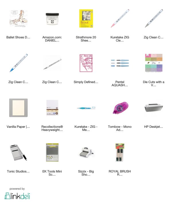
I love watercolouring, dance, and other artful things. It's always a pleasure to bring them together. I used Zig Clean Color watercolour markers with Daniel Smith transparent watercolour ground to colour this digital stamp from Sparkle N Sprinkle accenting it with a glittery die cut sentiment from Simply Refined.
Putting It Together
I've been increasingly frustrated by my craftroom printer. The original ink was water friendly. After replacing the ink, because it ran out, the black is not water friendly but the colour is. However, it's hit or miss if I can get a digital stamp to print with no black ink. I haven't tried taking that cartridge out so I don't know if it will complain about being out of ink without it. The printer will bring on heavy cardstock which is a major boon, but the ink factor has been driving me a bit bonkers.So... I watch art videos as well as crafting videos. One of the watercolourists blithely mentioned using transparent watercolour ground while she was doing a drawing. I actually forget the details of what she was using it for but the things which stuck in my head was that it makes any surface into a watercolour friendly surface and transparent. And then I half forgot about it until I was chatting with my friend who was over at my house for a crafternoon. Then, it became a necessity for me to find it and find it now vs ordering it online and waiting to get it.
This was the impetus for me to look up local art stores finding one in Langley. I took Tuesday off to catch up on a few things, including filing my Canadian taxes (the deadline was 30 April... Tuesday was the 30th *laugh*). When I was done with the things I needed to get done, I went out to the art store, Opus. I was a kid in a candy shop on a strict diet! Oh my! Oh oh oh oh oh my. And.. they had my ground at a price which is comparable to Blick taking into account the exchange rate. I was good. I only got the ground and two small paper pads of watercolour paper I hadn't tried yet (I like trying different papers and other water medium supplies).
I printed the same digi twice on Bristol paper. I chose Bristol because it is not watercolour paper. One of the images I treated with the ground, the other I left as is. The instructions on the ground said to apply with a sponge brush (I have some from the dollar store) and leave dry overnight so I did so. I originally planned this just as a quickie proof of concept so I wasn't as careful to cover the whole panel.
Last night, after work, I gave it a try. I used Zig Clean Color brush markers and a waterbrush. I first tried painting the shoe on the treated image and was floored. I did the same on the untreated image as a comparison. I loved the way the pigments moved and flowed and lifted and worked on the treated panel and I kept going, using a total of four colours.
This is why I am giddy with excitement. On the left is the untreated image. The right does have a bit more pink on it, but not much. On the left you can see how the black printer ink smears with the water, especially in the shadow areas where the ink line is thicker. On the right, no smearing. On the left you can see how the pink sinks into the Bristol and doesn't move much from where I applied the Zig brush directly to the paper, along the sides and where it would be shadowed. On the right, even with applying much thicker lines, you can see how the watercolour marker flows and blends with the waterbrush over the paper. The colour is also unmuddied on the right side.
On the treated panel, I didn't treat the upper left corner. You can see how the water-thinned pigment from the marker doesn't flow when it goes from the treated area to the untreated.
It was remarkable. And an astounding way to have my cake and eat it too, to use digital images with water-mediums without worrying about my printer being nice (other than for paper thickness).
So... I decided a little sparkle to make it a card. I die cut the sentiment with a Simply Defined (or Refined) die set from Scrapbooking Made Simple out of glitzy card stock and vanilla cardstock. I stacked them with the vanilla peeking out from behind in a drop shadow effect.
I added the sentiment to the panel and the panel to a white cardbase. I left the inside blank, at least for now. (Mostly because I ran out of time because of working on another project, too, last night).
Supplies
Challenges
Pearly Sparkles: At least 2 - Pink, Pearls, Sparkles (pink and sparkles)
Watercooler Wednesday: Feminine
Outlawz Monday Greetings: Anything Goes
Penny's Paper-crafty: Anything Goes
Crafty Addicts: Anything Goes
Watercooler Wednesday: Feminine
Outlawz Monday Greetings: Anything Goes
Penny's Paper-crafty: Anything Goes
Crafty Addicts: Anything Goes


Beautiful image and sentiment love the watercolouring.Thank you for joining us at Pearly Sparkles
ReplyDeleteCarol DT x
What a sweet card Kate. Lovely soft colouring to match the image. The sentiment clearly is talking to my ability as a dancer! Thanks for joining in the fun at the Watercooler Wednesday Challenge this week. Tristan DT
ReplyDeleteJust gorgeous Kate. Your colouring looks amazing using the watercolour ground. I have never heard of this before but it has allowed you to do some stunning work. Thanks for joining us at Watercooler Wednesday this week.
ReplyDeleteBeautiful card, RiJacki! Thank you for joining us at the Outlawz Monday Greetings Challenge!
ReplyDeleteBeautiful! Thanks for sharing it with us at The Crafty Addicts and I hope to see many more of your beautiful creations soon :)
ReplyDelete