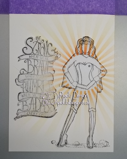
Be a strong, brave, humble badass! Stand proud and be yourself. My aspirational single layer card features stamps by Unity Stamp Co, stencilling with a My Favorite Things stencil and Distress ink, and colouring with Prismacolor pencils.
Putting It Together
I actually like the challenge of single layer cards. They make me have to think about how to accomplish the image in my head. Masking is a common solution to a lot of things. I love stencilling, too, and combining stencilling with masking on a single layer card gives me a thrill when it all works to fit the image in my head.
I stamped the image on masking paper. The advantages of the masking paper are that it's durable, doesn't absorb a lot of ink and bleed it out below, and it has a repositionable adhesive that won't hurt most papers.
And then I fussy cut the image.
I save my masks with the stamp in the same envelop so I can use them again.
I dry fit the sentiment I wanted to use with the mask of the wonderful woman to make sure they would fit together. I made a mask for the sentiment as well.
I then stamped both on my card base. After stamping both, I covered them with their masks. (If you mask an area without stamping first, it can be wicked hard to line up the stamp in the masked void, especially when it's a red rubber stamp and not clear. Don't ask how I know this *laugh*)
With the image and sentiment masked, I masked off the other side of the card base with Purple Tape (to make sure I didn't add colour to the back), positioned the stencil, then anchored just the top with another bit of Purple Tape. Having just the top of the stencil adhered lets it open like a hinge to check on progress. This is very handy when using more than one colour or when you want the to disperse colour lightly.
Using a Distress Brush cinched up to make the bristles firmer, I added colour to the sunburst. With each colour, I would start in the centre on the stencil and brush down the length of the ray to where I wanted that colour to stop lifting the brush in a sweeping motion. This makes the starting point darker with a gradual lightening to the end of the sweep.
I used four Distress colours starting with the lightest yellow out the furthest and the darkest orange the closest to the masked image.
With the stencil removed, the colour is present on the masks. With the masks removed, the image and the sentiment don't have any of the colour. This also makes the rays look like they're behind the image.
I used Prismacolor pencils to colour the image and the banners in the sentiment. I list the pencils I use so I can refer to them when I want to do a similar blend later.
Normally I would have a picture noting how I adhered thus and so to the card base and/or added embellishments, but, with a single layer card, I don't have any of that. I'm rather pleased with how this turned out. It fits the picture in my head perfectly.
Inside, I used another sentiment and coloured the star with gold and red to match the front.
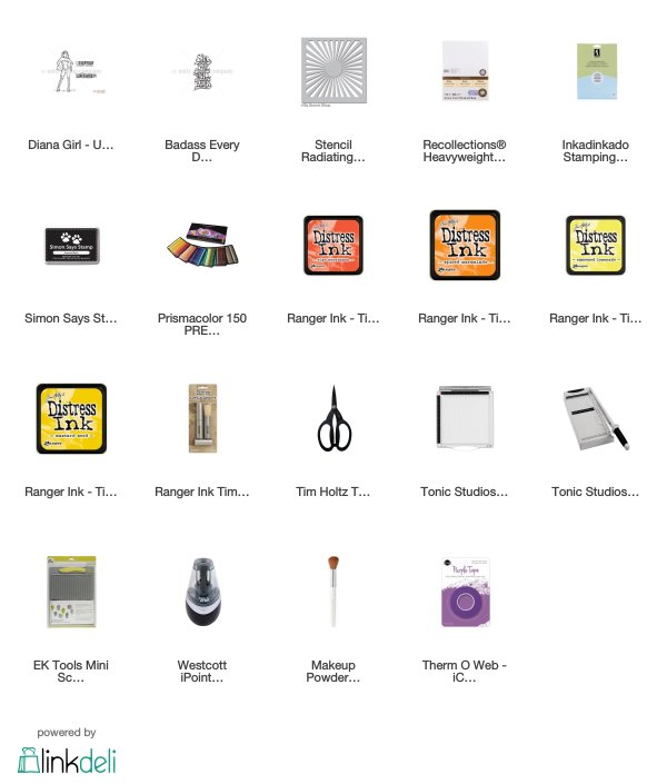
Supplies
Challenges
Unity {show & tell}: Single Layer
Try It on Tuesday: Use a Stencil
Outlawz Twisted Thursday: Favourite Product or Technique (masking, stenciling, single layer card)
Less is More: Shine a Light
Simon Says Stamp Wednesday: Anything Goes
Outlawz Twisted Thursday: Favourite Product or Technique (masking, stenciling, single layer card)
Less is More: Shine a Light
Simon Says Stamp Wednesday: Anything Goes


Wow - love how it turned out!
ReplyDeleteGreat to see your process. Your card turned out beautifully. Fab words and a great design... the stencilling looks super.
ReplyDeleteThank you for joining us at Try it on Tuesday.
Cath x
A fantastic one layer card. Thank you for sharing this with us over at Try it on Tuesdays..
ReplyDeleteYvonne
Fantastic card. Thank you for joining us at TioT.
ReplyDeleteWhat a wonderful card! The way you used the stencil to create the rays of light is fabulous 😁. Thanks so much for joining in the fun at Try it on Tuesday! J 😊 x
ReplyDelete